
Yes, I know.
It’s been a while since I’ve written one of these. I really neglected my blog & I am truly sorry. That will not happen again. Although I can’t promise when I’ll update it, I will make sure I give my readers at least 8 blogs in a year. Two every quarter should be easy right?
As some of you recall, I started a blog series called “The Art Consumption” where I would highlight some kind of art whether it was music, paintings, sculptures etc (that’s actually all I got to). Well, I’m starting my 2019 with some insight to some music related content I put out last year.
From July 2018 to December 2018, I released 12 tracks. Most of them were songs and a couple were instrumentals, all of which I am very proud of. I am equally proud of the combination of photography & graphic Design I released surrounding them . And after I released the playlist of all of those songs that made it to Lyrical Lemonade, I felt obligated to give insight to the content surrounding the music. So, for this blog I want to highlight the thought process behind each artwork for each of the singles I released.
The Vision
After meeting with my manager Mike Luna in early 2018, we made a goal to put out an abundance of music following my 2018 EP, “black & mild: black wayne”. For many of you that follow me, you know that the main inspiration for my music (other than my own life) is cinema/film. One of the things I enjoy most when watching a movie is analyzing the color grading for each scene. I often follow Cinema Palette pages on social media to get more insight to how scenes & colors palettes are strategically built to be pleasing to the eye.

Mad Max- Fury Road (2015)
dir. George Miller

Star Wars- Episode IV - A New Hope (1977)
dir. George Lucas

Django Unchained (2012)
dir. Quentin Tarantino
While on my visit in Chicago, I found the creative connection & began incorporating it into my picture post via Twitter & IG. Just to test it out and see how people reacted to it.

105 Likes, 3 Comments - pat junior (@iampatjunior) on Instagram: "chicago's been great. i've learned so much & i have gotten so much inspiration. most importantly,..."
Once I got the hang of it, I was inspired to create my own color palettes for my music. Each release would have 3 songs and each of those songs would have a color to go along with it that fit the song but also blended with the whole palette and “season”. Lastly, the small 3 color palette for each cover would be visible somewhere on the artwork. So, I called on two amazing artists who are apart of my creative team & who have helped shaped my brand to take on this task. Ryan Pham - Cinematographer/Photographer & Graphic Designer —Ruben Rodriguez.
For Summer 18’ (Part A)
For the summer I felt inspired to create music that hit hard, had bounce to it and something laid back. I already knew I wanted to use “bright” primary colors. However, I wanted to pick three items that represented the summer well, so that when people saw the cover, they knew immediately what they were diving into. I had the vision: in my head I saw 3 popsicles in my head melting. I already had the songs and so i just matched them with each appropriate color: Red (Pressure), Blue (Wouldn’t It Be Nice) & Yellow (Don’t Trip) — each of the colors had meaning as well Red = On Fire/Heating Up, Blue = Something Cool, Yellow = Slow Down.

During the shoot Ryan suggested the background, shifted my hands perfectly so that each photo would be identical (but slightly different for the “human” touch) and ever so patiently waited for each popsicle to drip so that he could snap a good picture. The last picture, (the first) was the hardest because I had to hold all 3 popsicles in my open palms. SUPER COLD! But it was worth it. If you look closely at the first picture, you can see the popsicle juice oozing past my fingers and under my hand.
Once we passed the pictures on to Ruben, he was responsible for taking the idea I had and bringing it to life with his style of design. This would be the template we would use for each season, only making small tweaks and refining the look along the way. I love Ruben’s BOLD designing mind. We went with a vintage/modern feel and he even added his own transparent sticker to each cover which gave each artwork an additional “modern” texture.
For Summer 18’ (Part B)
To close out the summer, I wanted to get a little more vulnerable with my pictures. The vulnerability was in line with the music. I had written about self love and an anthem about not needing anyone’s validation but my own. The songs had some bounce and “hardness” to the production but both were still “tender”. So I thought it’d be best to go with balloons. Pink (Love To Self), Royal Blue (Validation) & Pearl White (Free Peace). I believe the metaphors for these colors spoke well for themselves. In addition, this time around we decided to actually do more photos with the props to coincide with the theme. Here are some of my favorite pics from the shoot.

Ryan found all the spots and did an excellent job instructing me on how to pose for each shot. The first shot of me hiding behind the balloon was my only suggestion but despite the wind, he made sure we captured each shot as best we code. The editing came out gorgeous, too.

This time around, Ruben added a “18’” on the main cover with the color gradients to just to refine the design a little more.
For Fall 18’ (Part A)
The Fall is my favorite season. The warm but “dense” colors and textures that “fit” the season are just variants of their originals. They have such a bold & mature feel. For example: navy blue or forrest green. The music I released for this season definitely had that feel and contained similar content. Burgundy (Got It Good), Hold Your Own (Burnt Orange) and Forrest Green (Don’t Feel Right). Each had a mature and introspective look on certain topics, especially “Got It Good” (which is actually kind of a diss track to myself). For the same reason, I choice fruits and when we shot, we went for a more introspective look too. Here are some of my favorite pictures from this shoot.

Ruben decided to follow up the design with a chocolate background color instead of black. We both ended up thinking it would fit well with the full color palette as a backdrop color.

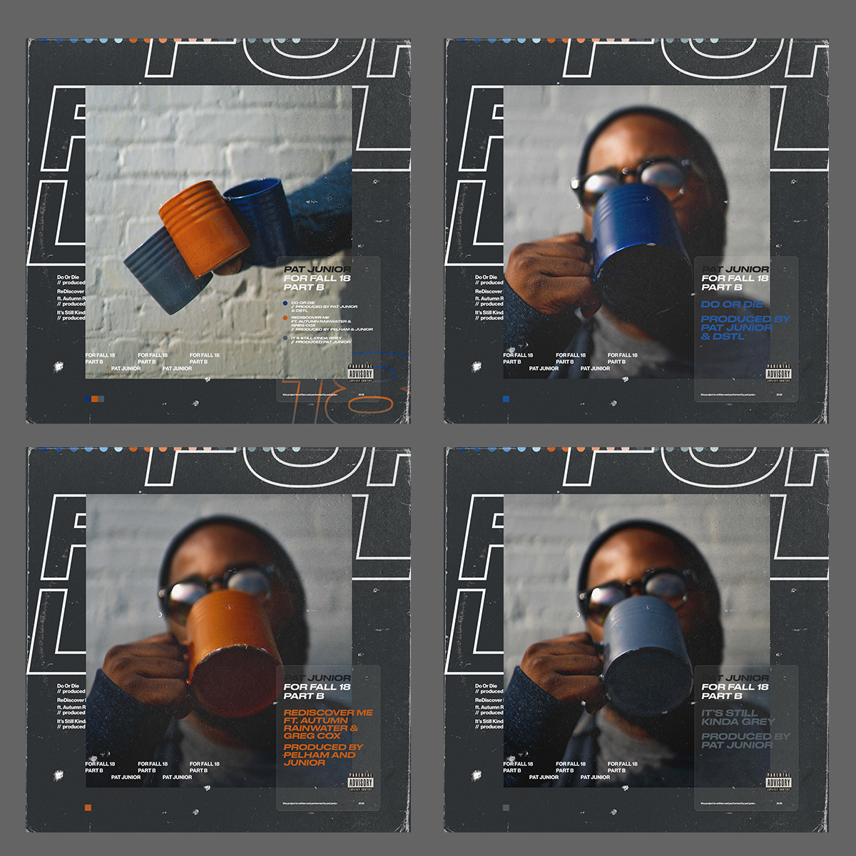
For Fall 18’ (Part B)
Last but certainly not least is the second part of the fall series. I made some metaphorical references to coffee in my lyrics and the music had a theme of “wokeness” about one’s self and surroundings, so I thought mugs would fit well. I didn’t use navy blue in the last series and really wanted to make use of the color, so I definitely took the initiative to use it here. Navy Blue (Do or Die), Copper (ReDiscover Me), Grey (Still Kinda Grey). We definitely played on the “hipster/informed” look with this one. Here are some of my favorite pictures from this set.
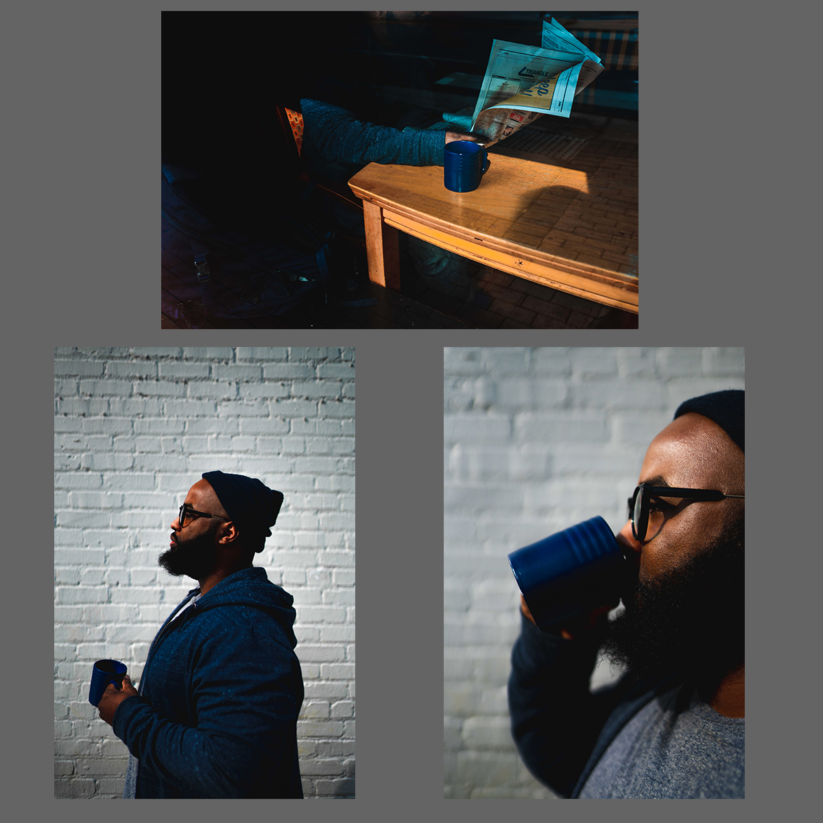
Ruben and I both agreed that this set needed a grey backdrop. The color palette would really thrive on each one. Much love to my little sister Tavia for painting the mugs for me!
An Unscheduled Close
I initially had some really dope ideas for the Winter & Spring series but with the other stuff I have plan for this year, I had to cut it short. I really had fun creating these color palettes and it really evolved my eye for creating new visual textures. What’s really dope about this process is that once people saw the For Summer 18’ (Part B), they started to anticipate the next color structure and were eager to see what items I would use next. Some creatives even messaged me and even shared how they were really appreciative of what I was doing with my music and visuals and were inspired by the concept as a whole. Some creatives even low key copied my idea in their own way and released their music/announcements (Don’t even trip, I’m not mad. I’m really flattered haha). I still make an effort to do my color palette posts every 3rd post on my Instagram and people tend to really enjoy them. Will I do another music series like this again and have the color palettes accompany them? I really don’t know but don’t count it out completely.
Til’ next time,
pat junior